

The Apple logo, one of the most recognizable symbols in the world, has become synonymous with innovation, simplicity, and technological excellence. However, the story behind its creation, evolution, and even some controversy is lesser-known but equally fascinating. Let’s explore the origins of the Apple logo, how it has changed over time, and the controversy surrounding it.
Origins of the Apple Logo
Apple’s journey began in 1976 when Steve Jobs, Steve Wozniak, and Ronald Wayne founded Apple Inc. The company’s first logo was far from the sleek, minimalist design we recognize today. In fact, it was a complex illustration designed by Ronald Wayne, depicting Isaac Newton sitting under an apple tree, with an apple dangling overhead. A banner around the frame read, “Apple Computer Co.” The image was inspired by the moment Newton reportedly discovered gravity after an apple fell from a tree.
However, this elaborate design did not last long. It was too detailed and intricate for branding, especially considering the company’s aspirations to break into the personal computing market. Jobs recognized the need for something simple, modern, and instantly recognizable, which led to a complete redesign.
The Creation of the “Bite” Apple Logo
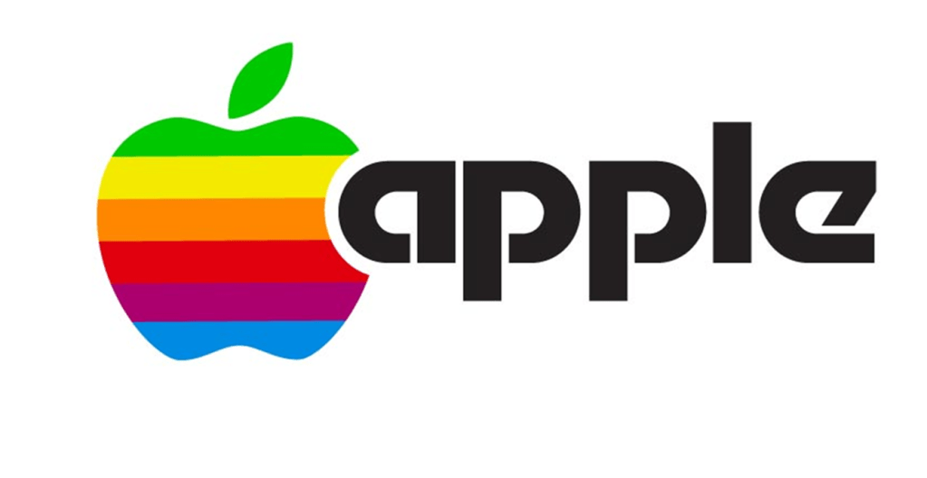
In 1977, Jobs hired graphic designer Rob Janoff to create a new logo that would better reflect Apple’s vision. Janoff presented Jobs with the iconic logo of an apple with a bite taken out of it. The simplicity of the design struck a chord with Jobs, and it was immediately adopted. The bite served a dual purpose: it made the apple shape easily distinguishable from a cherry or any other round fruit, and it also symbolized the idea of “biting” into knowledge—a subtle nod to Apple’s role in the computing industry.

Interestingly, there are several myths around the bite in the logo. One of the most popular theories is that it was a tribute to Alan Turing, a pioneer in computer science, who died after reportedly biting into a cyanide-laced apple. However, Janoff has repeatedly dismissed this notion, stating that the bite was simply added to prevent the logo from being mistaken for other fruits.
Evolution of the Apple Logo
Initially, the Apple logo was rainbow-colored, which became a defining feature of the company’s branding in the late 1970s and 1980s. The vibrant, multicolored stripes were meant to reflect the Apple II’s ability to display color graphics—a revolutionary feature at the time. The logo remained this way until 1998, when Apple adopted a monochromatic design.
The decision to abandon the rainbow stripes coincided with the company’s return to simplicity under Jobs’ leadership, following his return in 1997. The new logo, a sleek, single-color apple, better aligned with the company’s minimalist design ethos and the streamlined look of its products, such as the iMac and later the iPhone.
Since then, the logo has remained largely unchanged, though its color and finish have varied depending on the product and marketing campaign. For example, it has appeared in silver, white, and black in various contexts.
Controversy Surrounding the Apple Logo
Despite its simple and widely accepted design, the Apple logo has not been free of controversy. One of the most notable legal battles involved a trademark dispute between Apple and The Beatles’ Apple Corps, the multimedia company founded by the band in 1968. Apple Corps had originally sued Apple Inc. in 1978, arguing that the technology company’s logo and branding infringed on their trademark.
After years of legal wrangling, the two parties reached a settlement in 1981, with Apple Inc. agreeing not to enter the music business. However, this truce was short-lived. In 2003, Apple Inc. launched iTunes and the iPod, entering the music industry in a significant way. Apple Corps sued again, but the case was eventually settled in 2007, with Apple Inc. acquiring all trademarks related to the Apple name, including the rights to the logo.
Another aspect of controversy lies in the ongoing debate about the symbolic meaning of the apple and the bite. Some have argued that the apple is a reference to the biblical story of Adam and Eve, where the apple represents the fruit of knowledge from the Tree of Knowledge of Good and Evil. This interpretation has led to speculation that Apple’s logo symbolizes the pursuit of knowledge and defiance of traditional boundaries. While this theory is popular, there is no official confirmation from the company or Janoff himself.
The Apple logo, simple yet packed with symbolism, has become more than just a corporate icon. It reflects Apple’s brand values of innovation, accessibility, and user-friendly technology. From its humble beginnings with Isaac Newton to its modern, sleek design, the Apple logo has evolved alongside the company, adapting to changes in both technology and culture. And though it has faced controversy, both legal and symbolic, it remains an enduring emblem of one of the most influential companies in the world.
Apple’s logo is a masterclass in minimalist design, a visual representation of the company’s philosophy: less is more.

Leave a comment